FoodRX
A Ketogenic Meal Delivery Service

CLIENT:
FoodRX
ROLE:
UX Designer
TEAM:
2 team members
PLATFORM:
Website
DESIGN TOOLS:
Sketch, Invision, Mural, Trello
SERVICES:
Research, User Flows, Wireframing, Prototyping
About the Project
FoodRX is a meal delivery service that has based it's research and recipes on the ketogenic diet. The core belief is that while chemotherapy battles the cancer in their bodies, cancer patients need the nutritional support in order to strengthen the body that needs to fight the cancer. In other words, the chemotherapy will fight the weeds, but the rest of the lawn must not be ignored.
Challenge
Create a menu and ordering system that reduces friction and allows freedom in ordering options.
This work flow should include the full process of selecting food and the checkout flow. We decided to add subscription service functionality that could be useful to their users. During the kickoff meeting, the stakeholder requested to have a way to let users know that there will be a $1 deposit on the glass containers that the meals will come in.
Research
In this project I did user interviews, stakeholder interviews, baseline usability tests, heuristic review of the current site, as well as comparative and competitive analysis. I wanted to discover what the health goals of the users of FoodRX are. I wanted to discover if the current design works, and how it can be improved. But first, we had to discover who her target audience is, and who her potential audience may be.
I would like to discover the pain points that the current users may have with the current menu/ordering system that would dissuade them from completing their order, as well as difficulties throughout the checkout process.
Target Audience
The target audience of FoodRX are cancer patients and the caregivers of those patients. The recipes that the meals are prepared with come from a ketogenic diet cook book. In thinking holistically of the product, the audience could really be anyone seeking the nutritional benefits from that diet and wants the convenience of using a meal delivery service.
Interviews
The challenge I ran into was FoodRX does not have a very large user base, and their current users are cancer patients. Understandably this is a very sensitive subject, so it was difficult to find users that were willing to participate in our interviews. However, one of their users -- who was a caretaker for her mother who has cancer -- agreed to an interview with our stakeholder.
In order to overcome this challenge of finding users willing to participate I decided that it would be best to create some proto-personas. I needed to conduct a stakeholder interview about her current customers. Few things I learned:
-
Majority of her current users are the cancer patients themselves or their loved ones who are taking care of them.
-
Users are often too weak and tired to prepare their own meals.
-
Many of her customers found FoodRX valuable because it’s the only meal delivery service that’s based on the ketogenic diet.
-
Most of her customers experience these 4 symptoms: leukopenia, nausea, diarrhea and sore mouth.
Baseline Usability Tests
I conducted baseline usability tests with the current website in order to discover pain points that users may encounter with the current ordering system. My target audience were people who have used meal delivery services in the past. I tested on 4 users and discovered several issues in the flow and functionality of the menu system.
-
Users found it confusing that the current system had the ordering on one page and the selection of menu items on a different page.
-
Users would be able to add a package to their cart, but they had no idea how to specify the items in the packages until they get to the checkout page. Then they were frustrated that they couldn’t see the menu selection from the checkout page that they were on.
-
Users did not know what would happen if they picked a package and did not make meal selections, but were able to complete the order.
-
Users were surprised by the delivery charge when they went to checkout.
-
Users were confused how to set the delivery date and time. Requires too much effort.
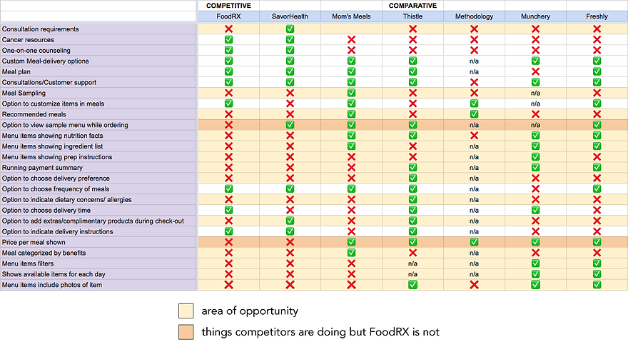
Comparative / Competitive Analysis
I found the competing services as well with websites that offered comparable meal delivery services and broke down the services into smaller elements and features, in order to compare what is currently being offered in the market, as well as what opportunities are there for us to set FoodRX apart from their competitors.
I highlighted the features that only had 2 check marks or less as an area of opportunity, and I highlighted the features that had mostly check marks, but FoodRX is not currently offering as areas that FoodRX would consider implementing in order to keep up with the competition.
Synthesis
After doing my research on the subject, my team and I started the analysis process. During this stage I utilized affinity diagrams, proto-personas, task analysis,
Affinity Diagram
I used a bottom up technique to form the group titles based on commonalities. First, I transferred transribed notes from the user interviews to a Mural document where my team and I were able to collaborate together on the groupings. I then took the groupings and created group labels. The commonalities would clue me into the personality types that described the FoodRX user base.

Developing Proto-Personas
From the information gathered from the stakeholder interview as well as the affinity diagrams, my team and I developed some personas that would help inform us who we are creating for, and take considerations of what that person may encounter. I created 2 archetypes that would represent the audience that FoodRX is aiming to serve.
I created the Primary Proto-Persona Lila the Cancer patient and the Secondary Proto-Persona Amanda the caregiver.
Lila is the cancer patient, she wants to be able to go through chemotherapy and fight cancer. She wants to eat healthfully, feel stronger, and be able to manage her chemo symptoms. She wants to feel independent and not be a burden on her family.
Amanda is the caregiver, she has different motivations and pain points, but similar goals. She wants her loved ones to feel better and have the strength to fight whatever ailment they are battling with. She has different pain points as she has juggle working and taking care of herself and her mother.


Ideation
After the synthesis of the insights I gathered from the research, and keeping the proto-personas in mind, it was time to brainstorm some ideas for the ordering process. In this phase, I developed sitemaps, task analysis, user flows, wireframes, and prototypes.
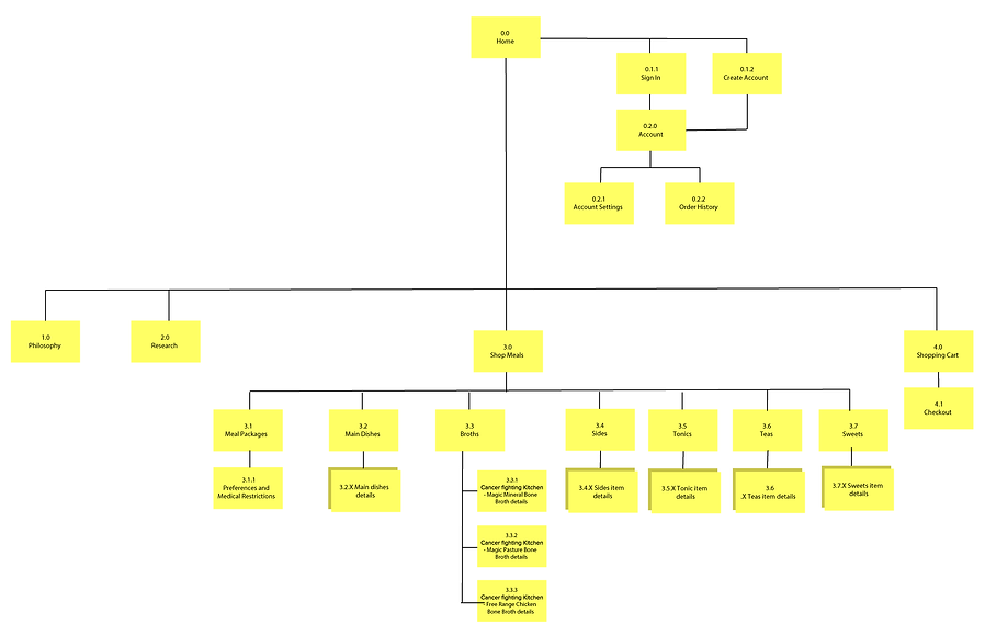
Sitemaps
I created a sitemap in order to organize the information architecture for my idealized FoodRX site. Our scope had us focus our efforts mainly on the Shop Meals section on the website. I would structure the site with the different menu sections, and each section would have it's group of items.
Task Analysis
I created a task analysis in order to really get into the shoes of the proto-personas that I created, Lila. This helped my team design solutions that would solve some of the issues that our persona Lila may encounter. I have to note that the flow as you see it here will evolve and change as my team and I work through the user flows.

User Flows
This was a pretty complex user flow to develop, because I wanted to develop a very open way of purchasing that I did not see in the competitive analysis. Our competitors either had the option of ordering a la carte or selecting a meal plan, and did not have the option of using the automated "chef's recommendation" selection. Based on the stakeholder interviews and the user interviews, I felt that FoodRX should be able to serve all of these different types of people.
Before the user even gets to see the meals, I wanted to assure that they are in the delivery area. FoodRX uses courier delivery services, they only serve in certain areas. I included a zip code entry input for the user to check their delivery area. This will prevent the error of users going throughout the whole process only to find out they just wasted their time, because they are outside the delivery area.
FoodRX has a rotating menu, so depending on the date you want your food delivered, you will have a different selection of food. I felt that it was important to first split the menu up by date. The user will select the delivery date from a list, this will load in the menu selection for that date. The original flow had the menu on one page and the ordering system on a different page. The menu page had various dates on the list of items, which would lead to errors in ordering, because customers would order items that are not for the delivery date that they intended. My thought is that separating the menu items by date first will prevent that error from occurring.
I wanted to incorporate the chef's recommendations selection, because I thought about someone going through Cancer treatments and chemotherapy, and tried to consider how loss of appetite and motivation would make it difficult to make those decisions. Before the system goes through the automated meal selection, I would devise a way for those patients to set their medical and dietary preferences for their meal selections.
During checkout I will include options to return used FoodRX glass containers from your last order. My team and I decided that it would be best to incorporate the cost of the container fee into the cost of the meals, this way users will not feel that there are 'hidden fees.' When users return their glass containers, they will get credited money. This gives users an extra incentive to return to the website to use their credits on new meals.
Another option in the the checkout will be to make the order reoccurring. I felt that if a user really enjoys the service and the meals, it made sense to make it easy for them to continue having that convenience and enjoyment every week.

Wireframes & Prototype
One of the difficulties that I encountered when designing these wireframes, was how to deal with being able to shop for meals a la carte or shopping with a meal package. My team and I decided to label meal packages "Special Packages" because some of the packages offered are just broth, and some packages had a lot of other items from different categories in them.
The most elegant solution that I came up to manage Special Package items and a la carte items with was the usage of the sidebar. The sidebar is your shopping cart, it would be dynamic, and will add meals that you have selected to your Special Package if you have openings in your Special Package. The shopping cart will also break down the items in the Special packages and let you know how much of each item you need to fulfill the package. Near the bottom of the sidebar there will be a tally of your entire cart.
The checkout button is to be greyed out until the user has made all the necessary selections. If shopping a la carte -- and not purchasing any Special Packages -- the shopping cart acts like any other shopping cart. The checkout button will always be available, as the user won't have any package requirements to select.
I will be incorporating the usage of filters so users will be able to select their medical and dietary restrictions, and only see the food that they can eat. It made sense to me that the health conscious audience that FoodRX intends to serve, cares for that kind of dietary information. There will be a "more info" button that will show a detailed description of the meal or item, as well as medical symptoms this item will help with, ingredients, and preparation instructions.
If selecting a Special Package, the user will have the option to select their own meals or select the chef's recommendations. This will take the user to a modal that will ask them about their dietary and medical preferences. Knowing this will help FoodRX understand what foods to avoid when curating their menu. When the curated menu is added to the user's shopping cart, they will be able to see and remove items that they don't want and replace that meal a la carte style.
Full freedom and flexibility while being user friendly and intuitive as possible was the goal.
I aimed to listen to the problems that the baseline usability tests were telling me to fix. I tried to keep my design as clean and distraction free as possible. FoodRX serves an older audience, so I made sure all the fonts I used were large enough, where digesting the information on the page wouldn't be a struggle. I needed to test and validate my theories, so I used Invision to put together a prototype for my wireframes. Please feel free to try out my prototype -- link HERE.


Validation
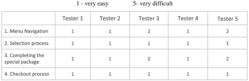
In order to validate some of my ideas, I took the prototype that I created and conducted usability tests. I tested my prototype on 4 people and I had them think out loud as there were going through the test. I was pleasantly surprised when all users were able to pass the test without issues. There were minor changes that I implemented into the final design, but the menu and ordering system were very intuitive for the users to navigate through.
Visual Design
I wanted to create a clean and professional looking aesthetic for FoodRX in order for their users to feel more confident in trusting them, essentially with their health.


Closing Thoughts
This project offered a lot of challenges. The challenge of not being able to interview with current users. The complexity of the buying freedom with both a la carte and meal package options. The intricacies of the Special Packages with various items from different categories. The challenge of creating a flow that would allow for an automated system of ordering food based on customer preferences. The incorporation of creating a subscription based meal program. The challenge of incorporating the glass container fee and return into the user flow.
I didn't want to compromise one feature for another, and wanted to create a feeling of freedom of user's choice.
In the end, I think that my team and I struggled a lot in being thorough in thinking through the different use case scenarios, and debated a lot about what flows did or didn't make sense. I really believed in the good that FoodRX is trying to do in helping Cancer patients, so I aimed to reduce as much cognitive load as possible for the user in order to make eating well and taking care of yourself and your loved ones as effortless as possible.

"Jimmy collaborated with another colleague to complete an incredibly complex redesign of the online buy flow for FoodRX, a meal delivery service that offers medically-tailored meals to cancer patients. The service is incredibly complex because it involves a rotating weekly menu with both a la carte and "pre fixe" options, subscription and non-subscription purchases, store credit for returning glass containers, and items need to be filtered not only by allergen and preference but also by side effect that a patient is trying to address. To makes things even more difficult, Jimmy only two weeks to complete the project and I, the client, was only able to provide one target user to interview. Jimmy and his colleague went above and beyond to find other individuals for usability testing on an incredibly tight timeline. They incorporated every detail I mentioned and thought of elegant solutions to problems I hadn't even articulated yet. His final deliverable was clear, concise, and incredibly thorough. I sincerely hope you have the opportunity to work with Jimmy; his hustle, thoroughness, and high-quality work product will not disappoint!"