Travel Buddy
A travel coordination app

CLIENT:
Personal project
ROLE:
UX Designer
TEAM:
Solo project
PLATFORM:
Mobile App
DESIGN TOOLS:
Sketch, Invision
SERVICES:
Research, User Flows, Wireframing, Prototyping
About the Project
Travel Buddy is a travel coordination app that I created as a study for my first project at GrowthX Academy. I wanted to do a travel app, but was open to where the research would lead me along the process.
I was inspired to do my research project on travel because I recently made my move from Southern California to San Francisco. I personally am not a big traveller, so I ran into some issues when it came to the many different options of public transportation in the city. It made me curious about the other travellers in the world who must run into some of these same navigational issues when in a new city, state, or even country -- where certain things like language barriers would make things exponentially more difficult. I wanted to make a way for people to easily connect with other travelers and share adventures together. Safety is the number one concern for solo travelers. When you travel alone, it is easy to be singled out and victimized. I wanted a way for solo travelers to have the freedom of doing the activities that they love to do, in far away destinations, while being able to maintain their sense of safety.
Research
In this project I did user interviews, surveys, and competitive analysis. I wanted to do a research topic based on adult travelers who travel solo for leisure. I wanted to know why some people choose to vacation by themselves. I wanted to target people who travel to places they have never been before, alone, with no friend or family resources to help guide them through their journeys. I would like to discover what types of techniques these travellers are using to help navigate them through places they’ve never been before and how they find things to do such as events and then getting to those events.
Target Audience
My target audience would be travellers between the ages of 18 to 40, who travel solo for leisure.
Hunt Statement
I would like to discover the pain points that solo travellers would encounter when they have not been to those locations before, have no friends or family members to help guide them, and how they overcome those obstacles.
User Interviews
I interviewed with 6 people in my network and I had 13 interview questions. All of the people interviewed were between the ages of 18-40 and had to have travelled before by themselves for leisure. I then went through the transcriptions of my interviews and color coded them based on if they were behaviors, motivations, goals, and pain points.
Survey
I put together a short survey and sent it out to some of my network. I received 9 responses to my survey. Below are a few of the results from the survey.

Competitive Analysis
I needed to find the competing apps in this sector. I download them and tested them against a set of requirements that I put together. I then had to discover patterns of opportunities. The green in the diagram shows that that feature is supported, and red means not supported by that app.

Research Insights
-
Most people do travel for leisure, and they find the most enjoyable aspect of travelling alone is not coordinating with other people.
-
People often use body language as the universal language when dealing with language barriers.
-
I discovered that some of my survey questions were not direct enough and they needed some re-tooling to be more effective.
Analysis
After doing my research on the subject, started the analysis process. During this stage I utilized affinity diagrams, personas, and journey maps.
Affinity Diagram
I used a bottom up technique in which we group similar notes together, then form the group titles based on commonalities. First I transferred transcribed notes from the user interviews to sticky notes. Then I grouped similar notes together. Then I had to come up with a common theme among grouped notes.

Developing Personas
In order to develop personas, I created archetypes from common sticky notes. I then developed a personality and bio of the personas based on motivations, goals and frustrations that were gathered from those archetypes. In this case, I created 2 personas that were opposites of each other in personality: the planner and the impulsive. Jake is my primary persona. He likes to travel for personal development. He loves to see new places and meet new people, but he finds coordinating with other people difficult.
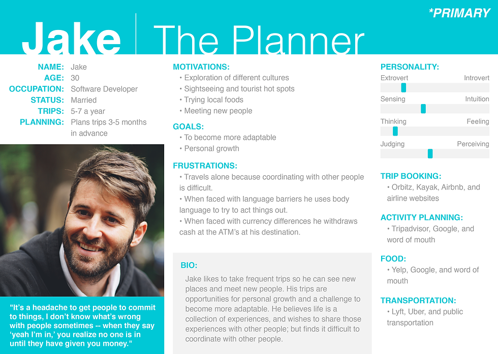
Primary Persona

Secondary Persona
Primary Persona
Creating a Persona Journey Map
I created a persona Journey Map in order to be able to get into the shoes of my persona, and consider the stages that they go through during their process. Using the archetypes that were created in the persona (Jake), I had to break up ideas of who they are by doing, thinking, feeling, and experience at each stage of the process. From there I would be able to derive opportunity that come up from frustrations or needs that they may encounter along the stages.

Ideation
After the synthesis of the insights I gathered from the research, it was time to brainstorm some scenarios and ideas for my app. In this phase, I did some storyboarding, created a sitemap, did a card sorting exercise, created some user flows, and created some wireframes.
Storyboarding
I created some hand drawn rough ideas of the environment in which my ideal users would be in when they wanted to use the app. My users would be travelers who want to connect with their friends or new people that they want to meet up with along their journeys. I wanted to give travelers the ability to coordinate time for meet ups with the ability to activate beacons so they can find each other easily. My users would be on the go, so this would have to be a mobile app. I needed to find a way for them to find friends, pick available time slots, request meet ups, and then be able to locate the people they are meeting.

Sitemap
I created a sitemap, essentially information architecture for my travel app. This allowed me to get an idea of the scope of my project as I have imagined it. I would be able to see how these pages were related to each other, how to make the flow of information, as well as to be able to count the amount of screens that I would need to wireframe.

Card Sorting Exercise
In order to validate my hypothesis of the information architecture that I created in the sitemap, I ran a card sorting exercise and sent it out to my network. Below is an image of the similarity matrix from the results of the card sorting. I have highlighted the groupings in different colors to help illustrate how these labels were grouped by people. This information went into the future wireframes.

User Flows
Now it was time to make sense of all of this information and create some user flows. User flows are diagrams of the direction that the user will take along their journey to complete their tasks. I created 3 user flow scenarios for my app:
-
Meet Request - where a user will request another user for a meet up
-
Request Approval - where a user who receives a request approval will be able to schedule a meet time and place
-
Available Mode - where a user will be able to set themselves as available for others to find and request hang outs with them

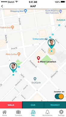
User Flow

User Flow

User Flow
User Flow
Wireframes
So here is where the rubber meets the road. It's time for me to take all the insights I gathered from the user interviews, and create something useful for my personas, and put together something that coherently moves through my user flows, in respect to the site map that I have created. Wireframes are conceptual layouts of how your app will look and feel. This is an attempt at visually making ideas and solutions usable. I needed a way for people to easily connect with other travelers and have adventures together, while being able to maintain a sense of independence and safety. I have included a link below to the prototype that you can go through.


Validation
In order to validate some of my ideas, I took the prototype that I created and did some usability tests. I tested it on 3 people and with the tasks mentioned in my user flow diagrams. I took what I learned from those tests and iterated on my wireframes twice.
Visual Design
I created some mockups for the final step in the process. I wanted to keep a clean and simple look and feel for the UI. I created the logo in Adobe Illustrator. All screens follow the same design style, fonts, and colors to keep consistant with the brand identity.


Closing Thoughts
I learned a lot during this 6 week project. I went through all the phases and played with all the UX tools in the UX toolbox. I really got an understanding of how one step builds upon the next step. I learned how the research becomes motivations, goals, and pain points. I learned how important it was to ask the right questions during the interviewing process in order to gather the right insights that would help me in my design process. I learned how research insights become personas, and how those personas are used in journey maps. I learned how important personas are in being able to really put yourself in the shoes of your users. I learned how those journey maps and site maps become ideas, and how those ideas become designs. I learned how important it was to validate those ideas by doing usability tests, because some of my ideas and assumptions are not always right.