iBiology
A medical resource for biology students and educators

CLIENT:
iBiology
ROLE:
Visual Designer
TEAM:
Solo project
PLATFORM:
Website
DESIGN TOOLS:
Adobe XD, Photoshop, Illustrator, Zeplin
SERVICES:
Visual Design, Photo Sourcing / Manipulation
About the Project
iBiology is an educational company that wanted to created an online biology resource for their students and educators. It is an article based website that would have articles that educators would be able to compile into a lesson plan. Students would have the ability to follow those lessons or create their own playlist of lessons. My role in this project was that of the solo Visual Designer. I was tasked to work with their UX Designer to compose a cohesive visual language and style guide for their website.
Challenge
The first challenge to this project was the fact that this would be primarily a remote job. I would meet with the UX Designer two to three times, but the rest of the team I would not be meeting. I would meet with the UX Designer, and we would discuss ideas and visual styles for the project. My assignment was to then take his wireframes, and create a cohesive visual language for the website.
The second challenge was my UX Designer requested that the work would be done in Adobe XD, I was told that the exported file was better compatible with Zeplin. I had used Sketch before, but I had not used Adobe XD yet. I was up for the challenge. Some personal research would be necessary to learn the ins-and-outs of how to use Adobe XD. I taught myself how to use Adobe XD after a few hours of researching and learning from YouTube videos. Luckily for me, there are a lot of similarities between Sketch and Adobe XD, so I was able to translate my skills with relative ease.
The third challenge was that because this website was to be an educational website, the stockholders wanted to assure that the colors used would meet the compliance of WCAG 2.0 AA due to iBiology's UCSF affiliation, but ideally we would meet the AAA compliance, because accessibility to information is pretty central to the mission of the project. Basically, I would have to focus on readability in color contrast and font size.
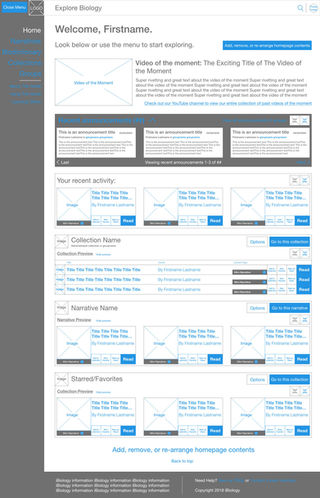
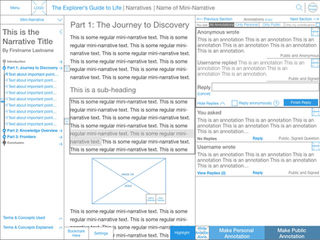
Below are some of the wireframes that I was given from the UX Designer. This would help you understand where I started and where I took the design. I was able to communicate with the UX Designer to understand where I was able to flex some of my creativity and where I needed to follow his layout.

Ideation
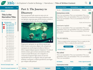
I wanted to create a visual language that allows users the ability to intuitively navigate through the content and consume the information.
I wanted to focus on clarity. There is a lot of information on each one of these screens. The challenge for me was to work within the guidelines of the UX Designer's wireframes, while keeping everything clear in functionality and readability. In the font usage, I am using a serif font - EB Garamond and sans serif font - Raleway to have a blend of the modern and the traditional looking serif font. The fonts had to pass WCAG 2.0 AA compliance, so I had to design with that in mind and make them large enough as well as having enough contrast to pass. I went with an overall lighter theme for the body of the webpage, and juxtaposed it with a dark footer.
I wanted to create a feeling of organized information. I didn't want the students to have to struggle to understand how the webpage operated. I aimed to create logical visual cues for the user to be able to pick up on and intuitively understand what they can do with the site.
In some of the splash pages like the sign-up and 404 error pages, I was able to play a little with the photos that I selected. I was inspired by the connection in biology and nature, so I had a little fun having those creatures subtly interact with my design.
Closing Thoughts
I had a lot of fun working on this project. I was happy that I was able to work with the UX Designer to understand how much of his wireframes I had to stick to and how much I had a little bit of design freedom. I had to really work on my communication skills in this project due to it being almost purely remote. I am very happy with how this turned out and really felt that my contribution helped the overall design and will help students and scholars to be able to both post their articles and knowledge, and to be able to organize lessons and learn.


