Slant
A product recommendation community

CLIENT:
Slant
ROLE:
Project Manager / UX Designer
PLATFORM:
Mobile App
DESIGN TOOLS:
Sketch, Mural, Trello
About the Project
Slant is a product recommendation community with the goal of making it effortless to find the best product, app or game. The core philosophy aims to provide information organizing around the product research process, powered by people helping each other be empowered and informed with their product purchases.
Slant is a startup, which already has a product that people are already currently using. The design suggestions are based on user research and feedback. In this project we worked in an agile 2 week scrum production schedule, so there was a lot of work to do in not a lot of time. As requested by the client, this was to be a research focused project. I would be doing some wireframes to draft our ideas, but I will be leaving those as sketches, and not brought into a digital app in order to focus on the research and ideas. This way we would not be distracted by thinking too much about aesthetics.
Challenge
The project is to create a design for Answer View, a feature of a mobile app currently in development.
Research
In this project I did user interviews, surveys, stakeholder interviews, and competitive analysis. We wanted to discover what would make users confident in the recommendations given to them by increasing the buy button click through rate by 5-10%. Slant’s goal is to make the confidence in choosing the best product recommendation quicker and easier. We had to offer informed design suggestions for Answer View based on research insights.
How shall we give users the confidence in product reviews when online shopping?
User Interviews
Although Slant already had an existing product, they only provided me with one of their current users to be able to interview. I had to look to my personal network to find people to interview. Luckily they had a pretty broad target audience -- people who do online shopping and research -- so I was able to find some people to interview.
• I interviewed with 6 people in my network and we had 13 interviews altogether.
• I had 10 interview questions.
• I transcribed the interviews and wrote down all the key insights.
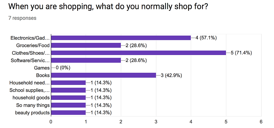
Survey
Slant had a survey that they put together, but some of the questions were leading questions, so we couldn't use those results. I put together a short survey of 13 questions and sent it out to some of our network. I received 7 responses from that survey.
Competitive Analysis
I needed to find the competing websites in this sector. I went through and compared Slant as well as their competitors against a set of requirements that I came up with. I then had to discover patterns of opportunities. The opportunities that I discovered were that none of the competition had a mobile (iOS) app, a responsive website, tags, and retailer free shipping and return policy details.

Research Insights
-
The internet is full of answers and opinions, and when doing online product research, people are sometimes overwhelmed by the large amount of options
-
People needed a way to compare specifications of products they are shopping for side-by-side
-
People don't know if the people writing the reviews are reputable or if they are trolling
-
People have difficulties shopping online because they can't see the quality of the materials or be able to try on the clothes
Analysis
After doing my research on the subject, I started the analysis process. During this phase I did affinity diagramming, developed personas, and produced a task analysis.
Affinity Diagram
I used a bottom up technique in which we group similar notes together, then form the group titles based on commonalities. First I transferred transcribed notes from the user interviews to sticky notes. I then recreated those sticky notes to a digital version using Mural. I had to do this in order for our contact at Slant to be able to review and work with us on the findings. I then grouped similar notes together. I had to come up with a common theme among grouped notes. These insights would be used in the development of the personas in the upcoming steps.

Developing Personas
In order to develop personas, I created archetypes from common sticky notes. I then developed a personality and bio of the personas based on motivations, goals and frustrations that were gathered from those archetypes. In this case, I created 2 personas that represented the Slant user base: the technophile and the recluse.
Brian was the technophile, he is into gadgets, and is overwhelmed by an ocean of options the internet provides, needs more technical specifications, and doesn't know how to gauge the reviewers who post reviews. Jennifer was the recluse. She is a stay at home mom, so she was concerned about being able to shop and buy groceries online, while still being able to take care of her young daughter. Her pain points are finding the right fit and feel (material) in clothing she bought online, and being able to shop on her own schedule without having to deal with parking or time schedules of department stores.

Primary Persona

Secondary Persona
Primary Persona
Creating a Task Analysis
I created a persona Task Analysis in order to really get into the shoes of my persona (Brian). I analyzed the task starting from a Google search of the product, and it spans the thought and actions that Brian would have to go through in order to do research, filter his options, compare tech specs, and then end up gaining the confidence he needs in order to buy the product.

Ideation
After the synthesis of the insights I gathered from the research, it was time to brainstorm some ideas for the Answers View portion of the app. I now had a good set of pain points to try to solve, I just had to find some elegant ways to solve those problems. In order to do this, I had to go back to the research insights that we found, and ideated some solutions for each problem.
Problem:
-
The internet is full of answers and opinions, and when doing online product research, people are sometimes overwhelmed by the large amount of options
-
People needed a way to compare specifications of products they are shopping for side-by-side
-
People don't know if the people writing the reviews are reputable or if they are trolling
-
People have difficulties shopping online because they can't see the quality of the materials or be able to try on the clothes
Suggested solution:
-
A possible solution to this is incorporating filtering and sorting of results in order to narrow down what you are looking for
-
A possible solution to this is implementing a comparison selection and viewing so you can view side-by-side technical specifications
-
A possible solution to this is having a rating system for the people writing the reviews, so users can gain trust in the reviewer's experience
-
A possible solution to this is having a clear view of which affiliates offer free shipping and a good return policy, it will help alleviate the fear of buying the wrong fit or material for their needs.
Sitemap
I created a sitemap, essentially information architecture for the Answer View page of app. This allowed me to get an idea of the scope of the project. I would be able to see how these pages were related to each other, how to make the flow of information, as well as to be able to count the amount of screens that I would need to wireframe. Although the scope of my project in just designing the Answers View page instead of the whole application, made it very limiting. I still made a sitemap to understand where it fit in relation with the other pages around it.

Wireframes
So it was time for me to take my personas and pain points, and come up with some recommendations for the Slant team to be able to solve those issues. The limiting factor of only working on the Answers View page was definitely a challenge.
In my wireframes I wanted to solve the problem of having too many options by implementing filters and a sorting feature. Users would be able to compare the technical specifications of a few of their choices side-by-side in order to make a better informed decision. Also I wanted to implement a scoring system or reviewer reputation score in order for users to be able to see if the person writing the review has a reputation in the community for being knowledgeable or helpful.

Answers View with Progressive Disclosure examples


Answers View with Progressive Disclosure examples
Visual Design
Although the project ended when we delivered the wireframe as the final deliverable, I don't believe you really understand how your product will read and communicate until you do the final Visual Design. I completed this visual design after the project was over in order to understand the full experience of how my product will look and feel.


Closing Thoughts
I learned a lot working on this project with Slant. I learned how to work with time and design constraints. I had to really plan out the timing and scheduling of the different components. I was Project Manager, so I had to keep a Trello board updated and created due dates to keep the team on task. I had to make sure our ideation was within scope. The challenge I ran into was that I did not have access to interview current users, so given the time constraints, I had to improvise with people within our network who generally have done product research, rather than the current users of their product. In doing so, we resulted with less impactful pain points -- that interviewing current users may have uncovered. I had to really think on my feet on this project in order to deliver meaningful solutions to my client. In the end, I am confident that I was able to deliver Slant some great ideas and recommendations and suggestions that would help their company reach their audience better and grow.