BCMI
Building Construction Material Initiative

CLIENT:
BCMI
ROLE:
UI / UX Designer
TEAM:
2 team members
PLATFORM:
Website, Tablet, and Mobile
DESIGN TOOLS:
Sketch and Axure RP
SERVICES:
User Flows, Wireframing, Prototyping, Mockups
About the Project
During my nearly four years at BCMI, a technology company serving the concrete and construction space, I worked as the UI/UX Designer responsible for improving their SaaS application. My role involved designing intuitive interfaces and optimizing user flows across web, tablet, and mobile — helping deliver a more efficient and consistent experience for end users.
The Work
At BCMI, I crafted a sophisticated mobile app experience that optimized user interfaces and improved overall interaction for users in the concrete and construction industry. I advanced the platform’s user experience by expanding and refining the usability of the B2B SaaS product across web, tablet, and mobile platforms — ensuring consistency and efficiency throughout.
I designed detailed mockups and wireframes to communicate product concepts clearly, streamlining collaboration between design, product, and development teams. Additionally, I defined and maintained a comprehensive design system that established clarity, consistency, and scalability across all UI elements.
Target Audience
Our target audience included producers and contractors within the concrete industry. This diverse user base ranged from office-based roles—such as sales representatives, accountants, dispatchers, and management executives—to field-based users working in operations and on job sites.
To address their distinct needs and work environments, I tailored the user experience accordingly:
-
Office users primarily interacted with the platform on the web, where I focused on creating efficient workflows and clear data visualization.
-
Field users relied on tablets and mobile devices, so I designed streamlined, task-focused interfaces optimized for mobility and quick decision-making.
By aligning each experience with the user’s context, I ensured the platform remained intuitive, accessible, and effective across all touch points.
User Flow
I created detailed user flows to storyboard how users would navigate through my designs. These flows mapped out each step of the user journey, including both user-driven decisions and system-automated actions.
By visualizing the complete process, the user flows served as an effective communication tool—helping the team understand how I intended users to move through the interface and complete key tasks. This alignment ensured that everyone shared a clear vision of the user experience before moving into high-fidelity design and development.
![25772 [User flow] Pump truck solution.png](https://static.wixstatic.com/media/2e90c6_0c1c0a1d162b4375a64701b4bd8b81cb~mv2.png/v1/fill/w_880,h_585,al_c,q_90,usm_0.66_1.00_0.01,enc_avif,quality_auto/25772%20%5BUser%20flow%5D%20Pump%20truck%20solution.png)
Wireframes
Wireframes served as the rough draft of my design process. These low-fidelity layouts allowed me to communicate my vision for both the structure and functionality of the interface.
Through wireframes, I illustrated the overall layout, content hierarchy, and interaction patterns—showing how navigational elements would work together to create an intuitive flow for the user. This stage helped align the team around key design concepts before moving into high-fidelity design and prototyping.

Prototypes
To effectively communicate my design concepts to stakeholders and the development team, I created interactive prototypes based on my mockups. Using Axure RP, I built detailed, clickable prototypes that demonstrated how the designs would look, feel, and function in real use.
These prototypes served as a valuable tool for collaboration—allowing stakeholders to experience the intended flow and interactions firsthand, and helping developers better understand design specifications before implementation.
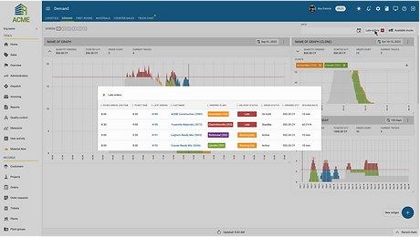
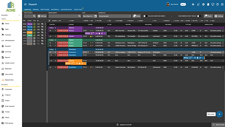
Mockups
Mockups represented the final stage of my design process. These high-fidelity designs were created to align with the established design system, providing stakeholders and the development team with a clear visual reference for the finalized product.
During this stage, I paid close attention to typography, color usage, and component consistency to ensure the designs fit seamlessly within the existing application. The result was a cohesive, user-friendly interface that maintained visual harmony across the platform.